.svg)
This page gathers a selection of data visualisation works developed during my professional experience at Metabolic, an Amsterdam-based consultancy and design studio that works on research-driven projects related to the circular economy, systems thinking, and regenerative processes.
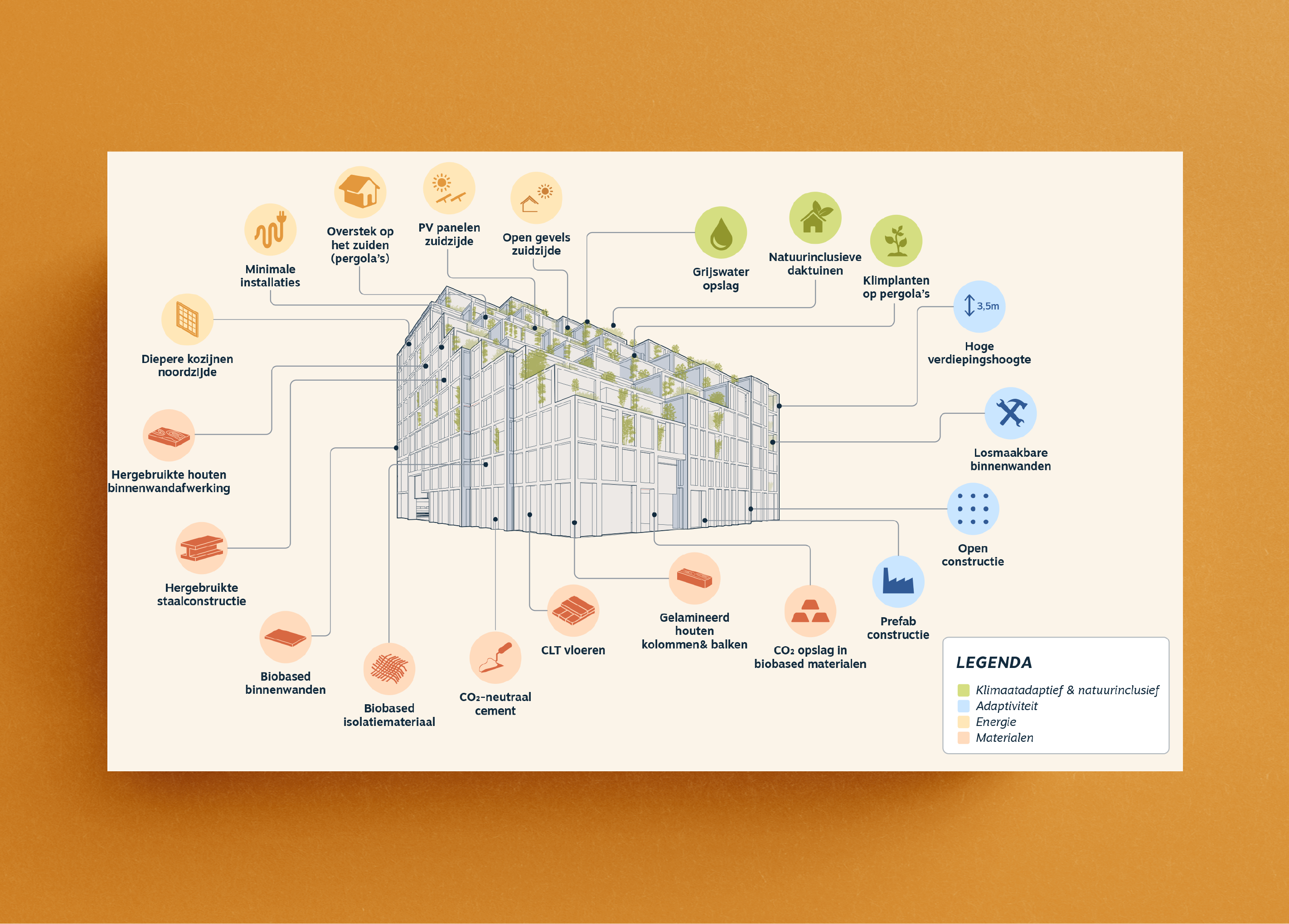
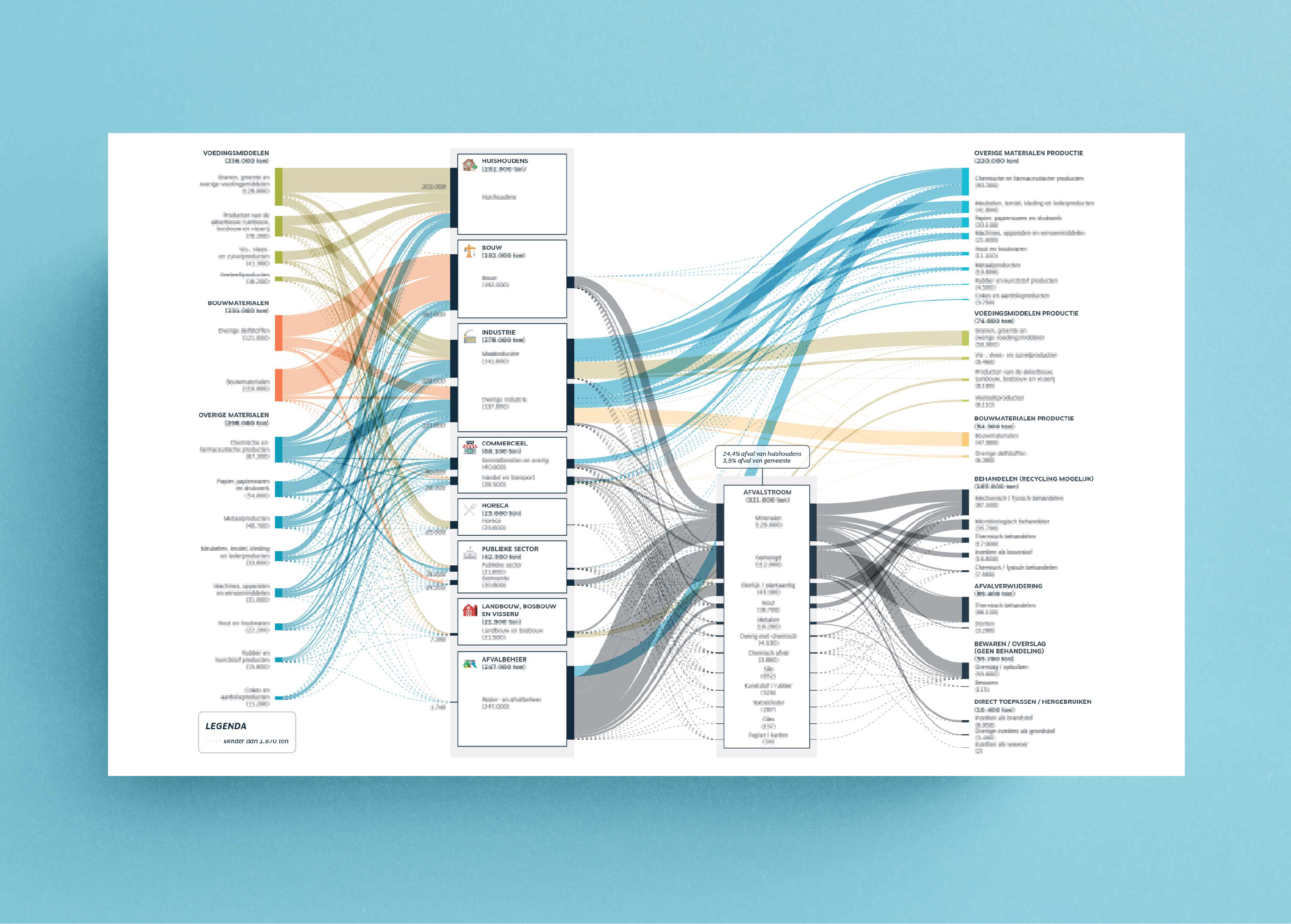
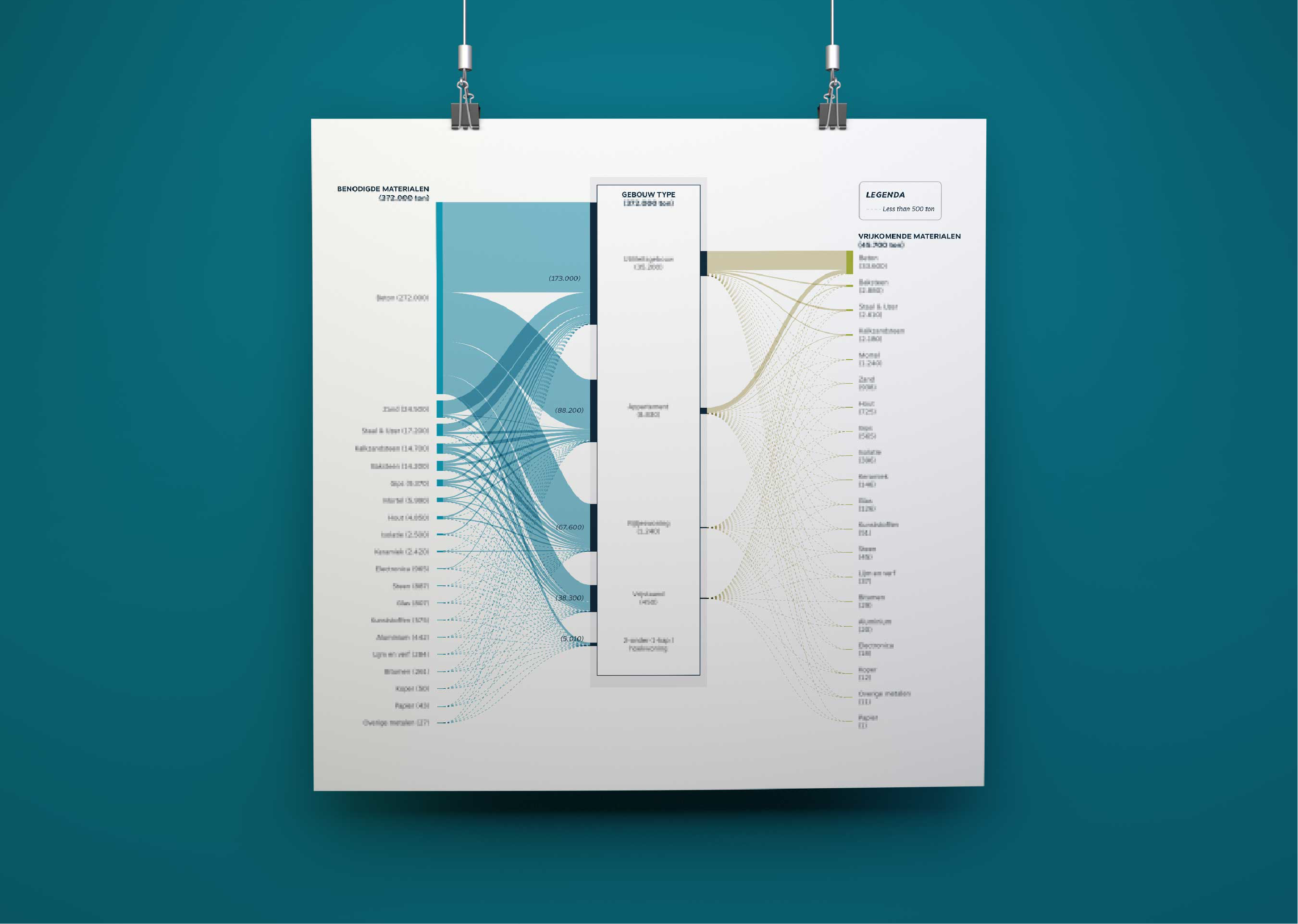
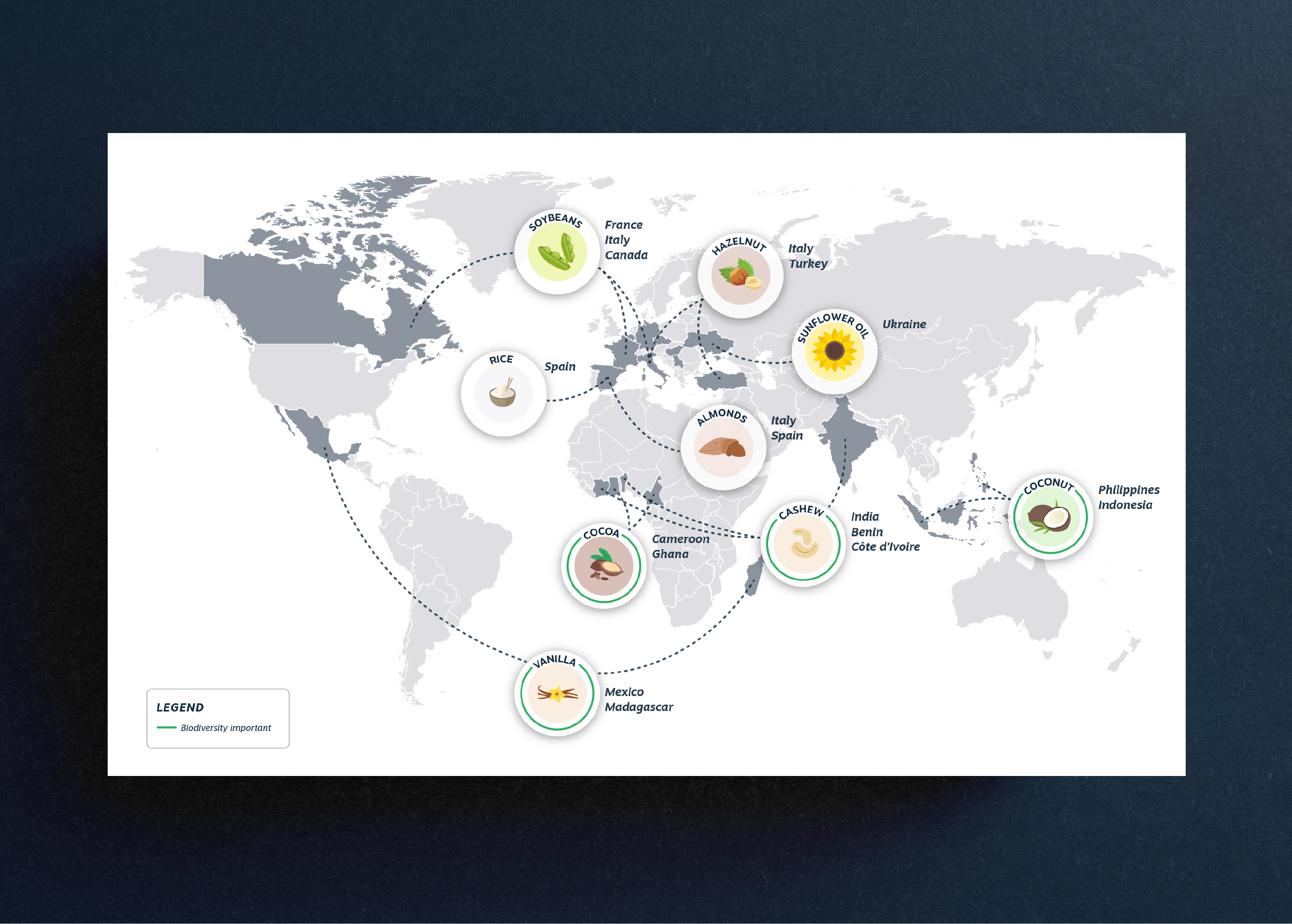
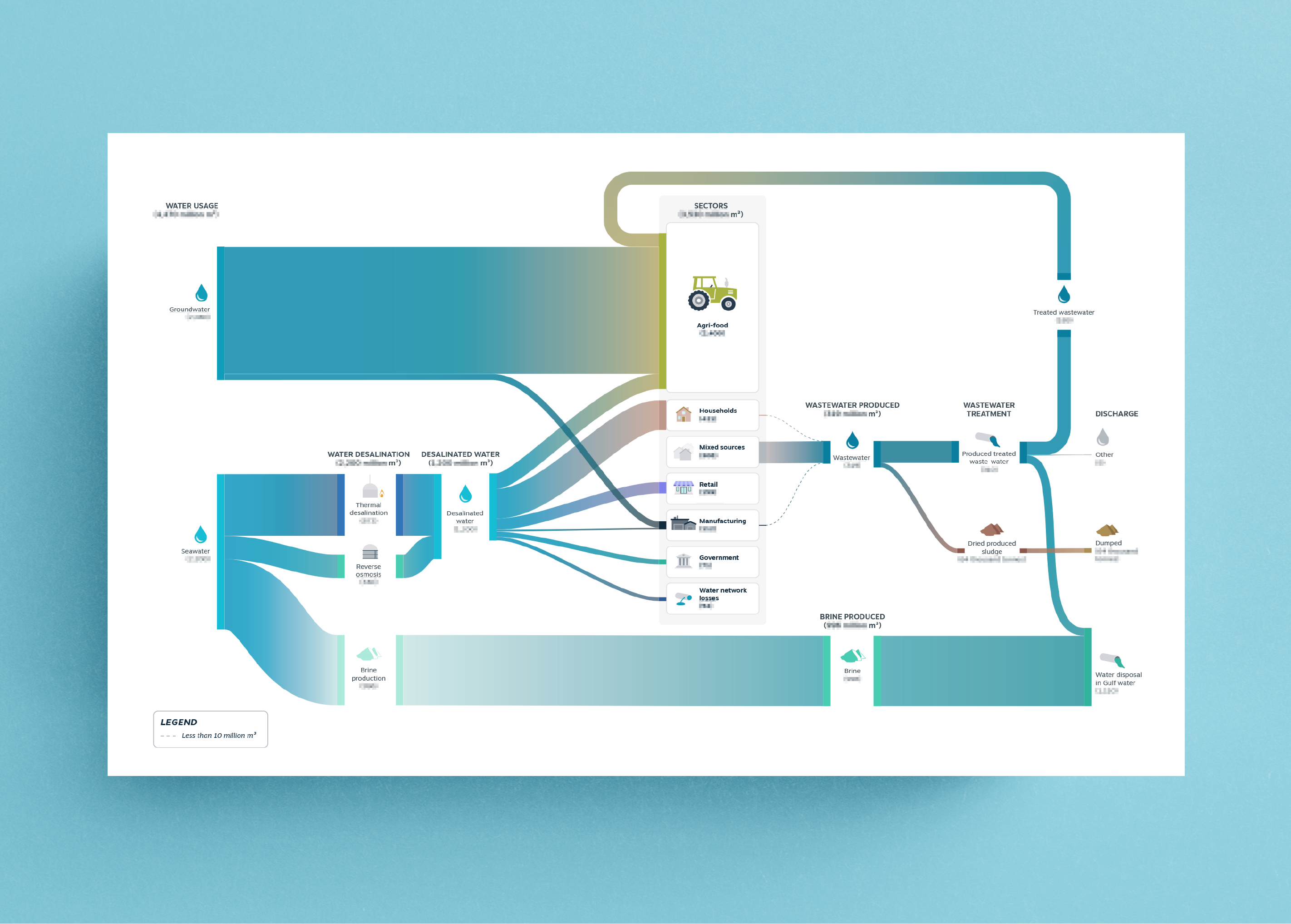
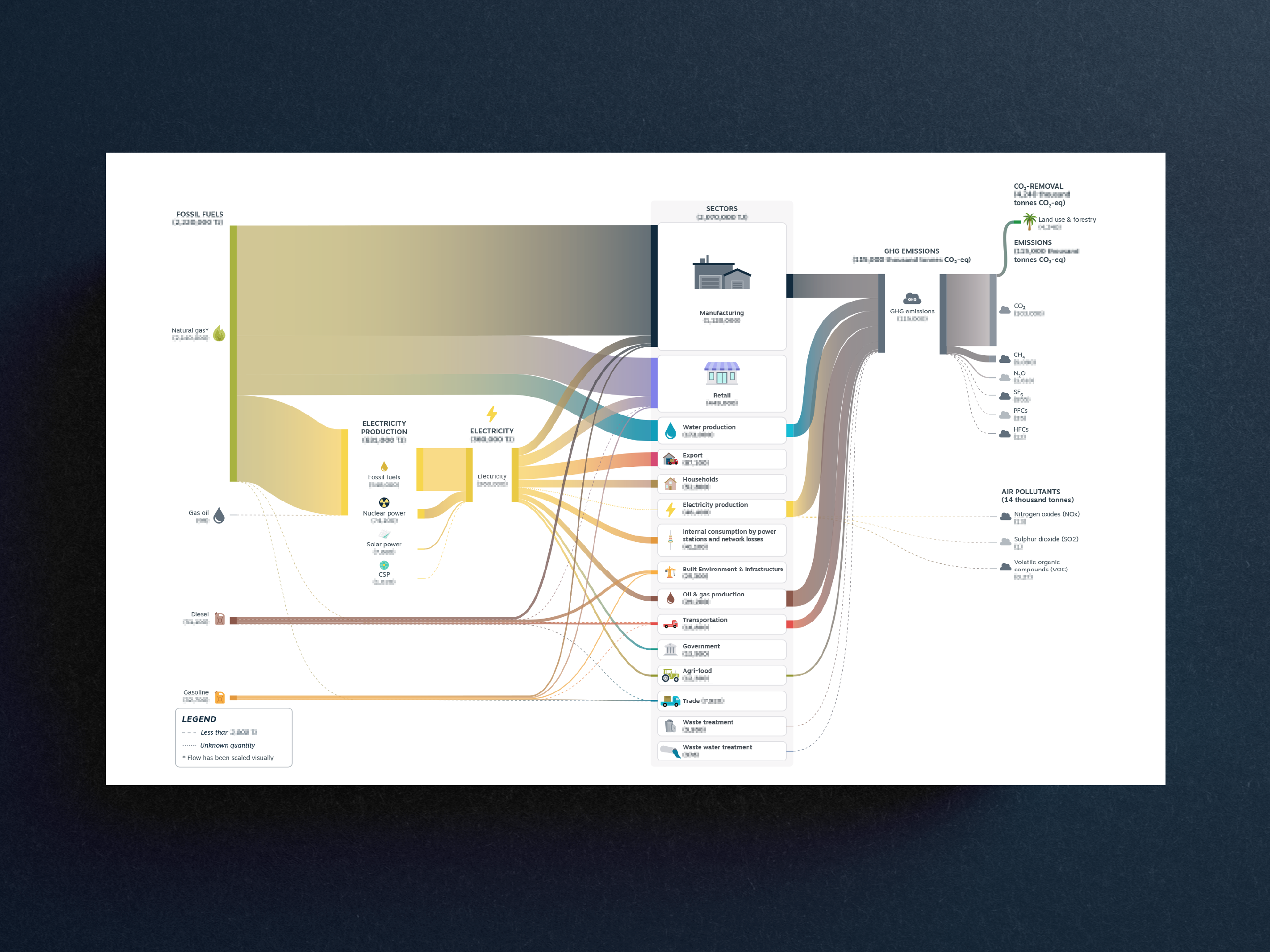
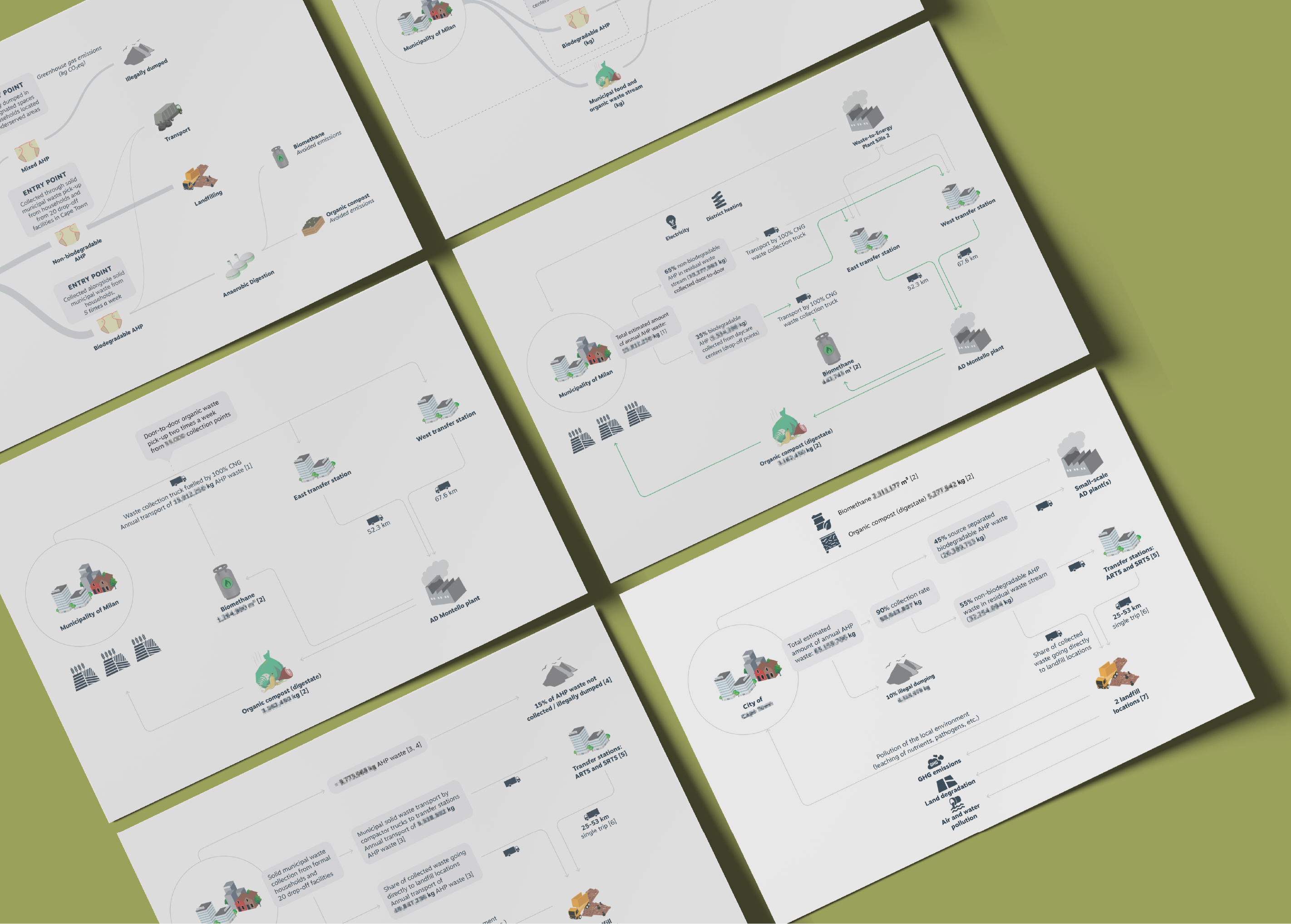
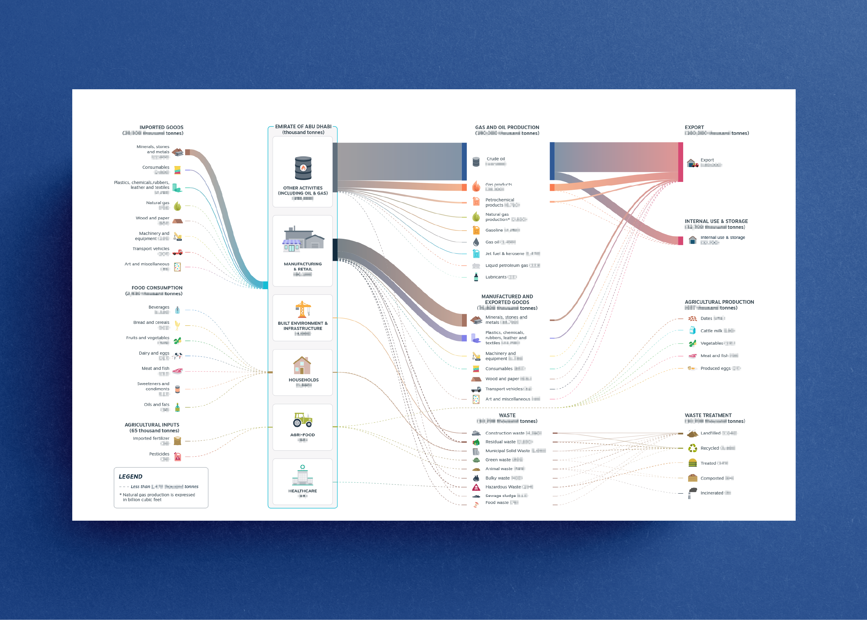
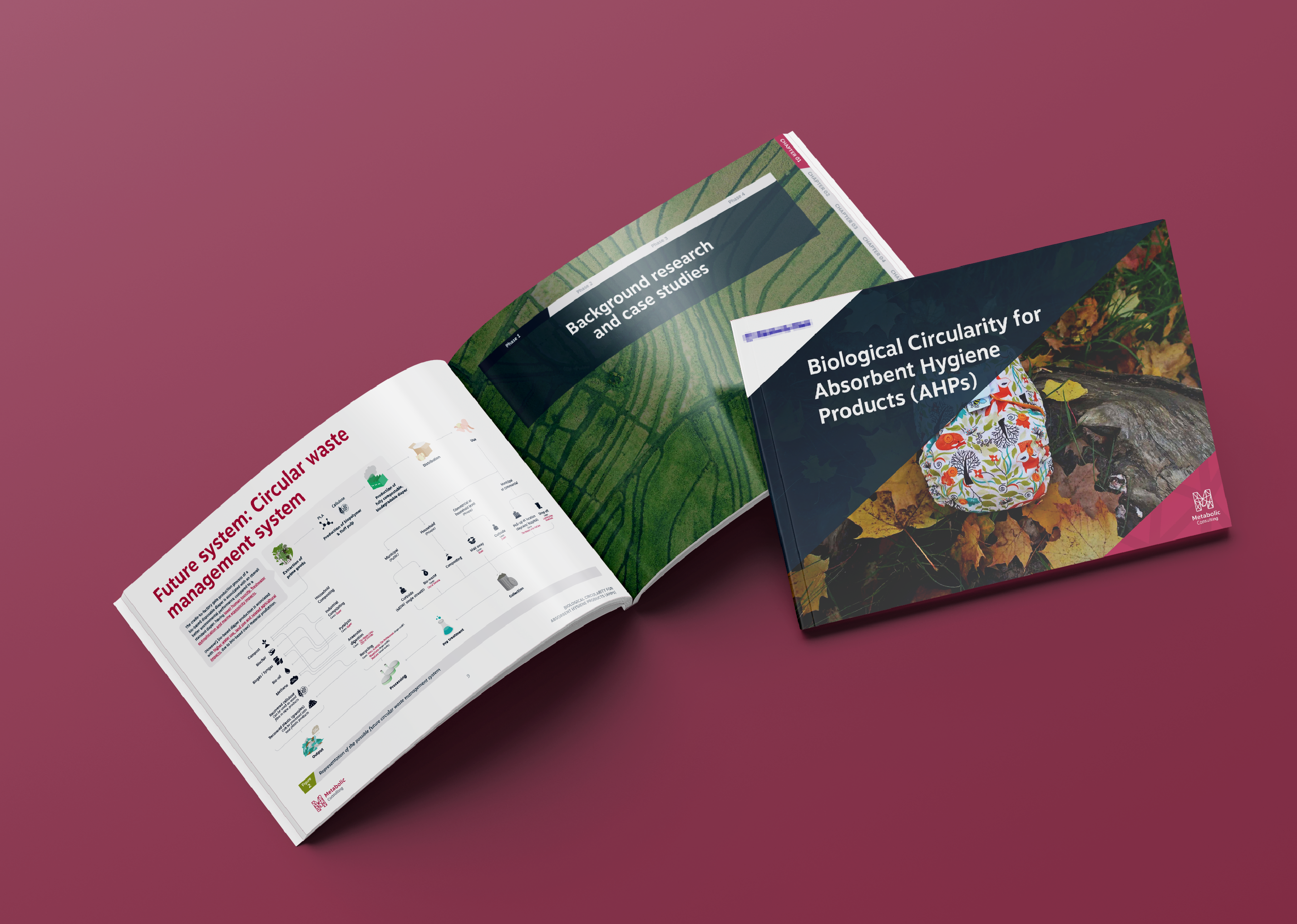
During this period, communicating complexity while "doing epic shit" has been the daily motto. As an Information Designer, I studied and interpreted complex data and shaped them in various forms to make them understandable for the national and international audience. I had the chance to work on multiple projects, exploring several sectors and fields, from building construction to waste management, transport systems, textiles, and agriculture. Systemic approaches have been used in these projects to rethink standardised linear processes, giving new space for regenerative and circular solutions.
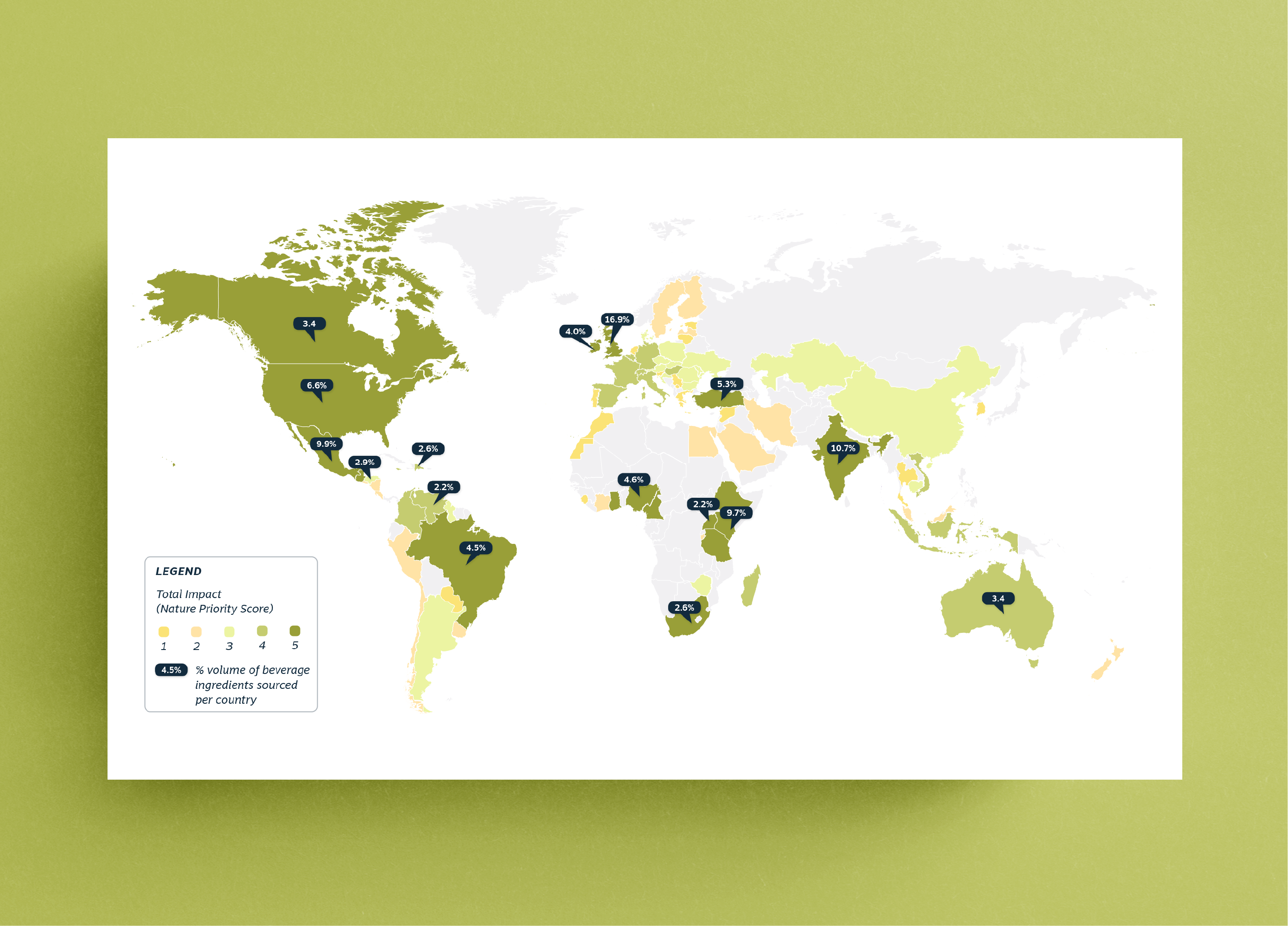
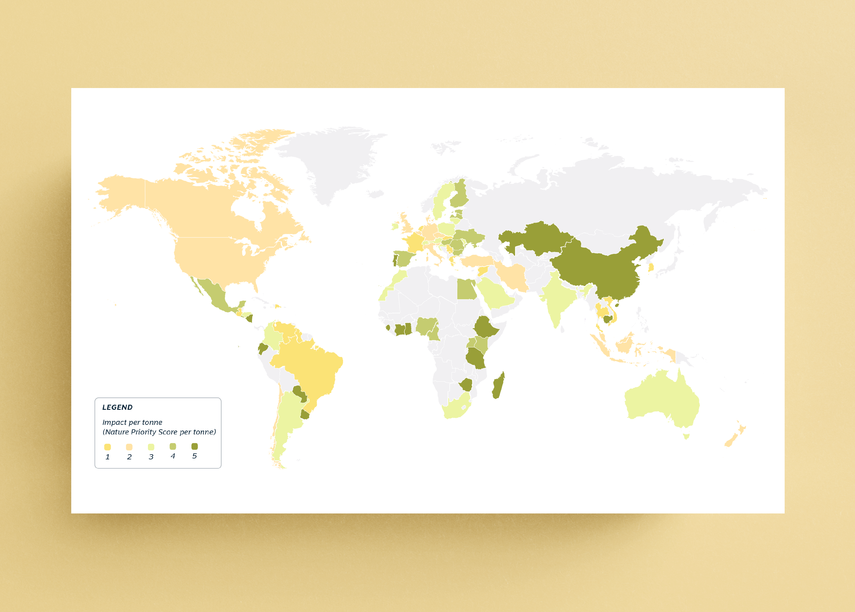
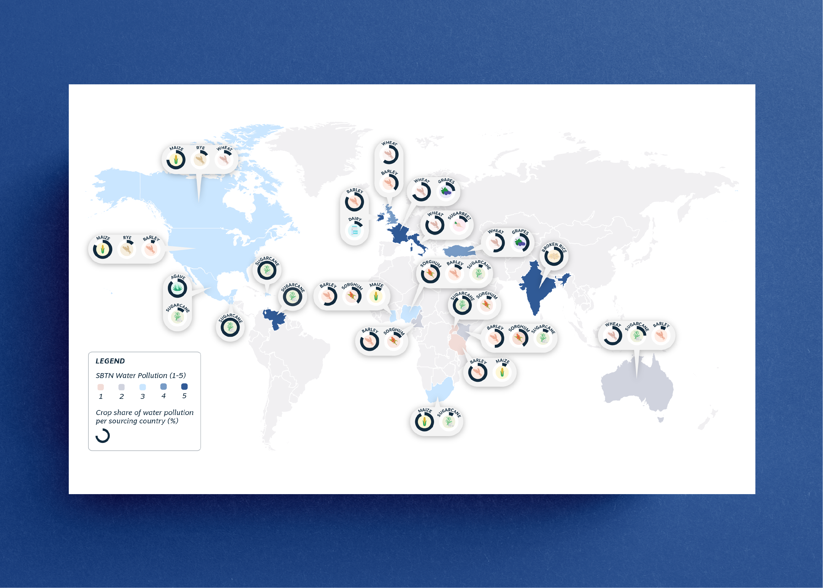
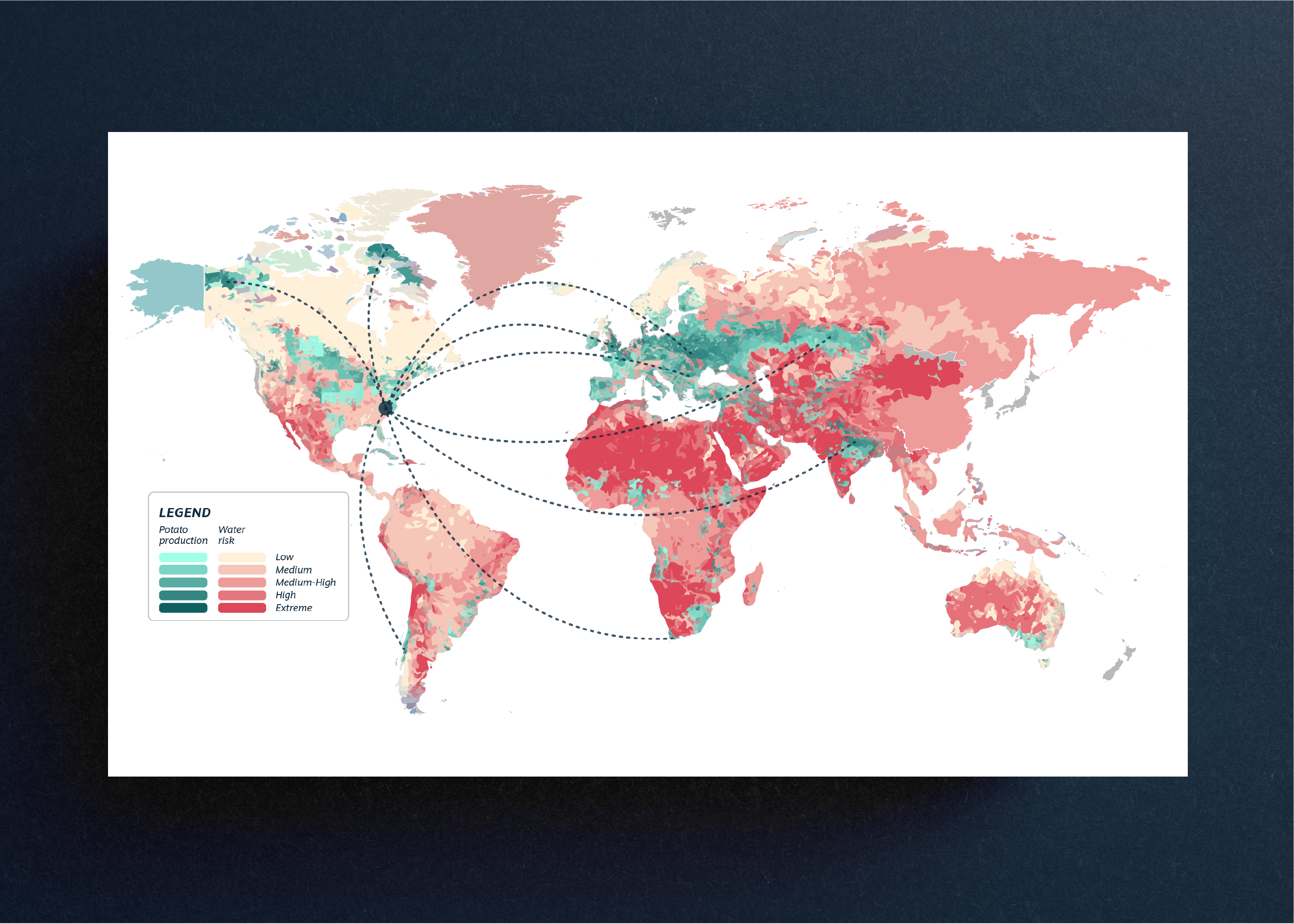
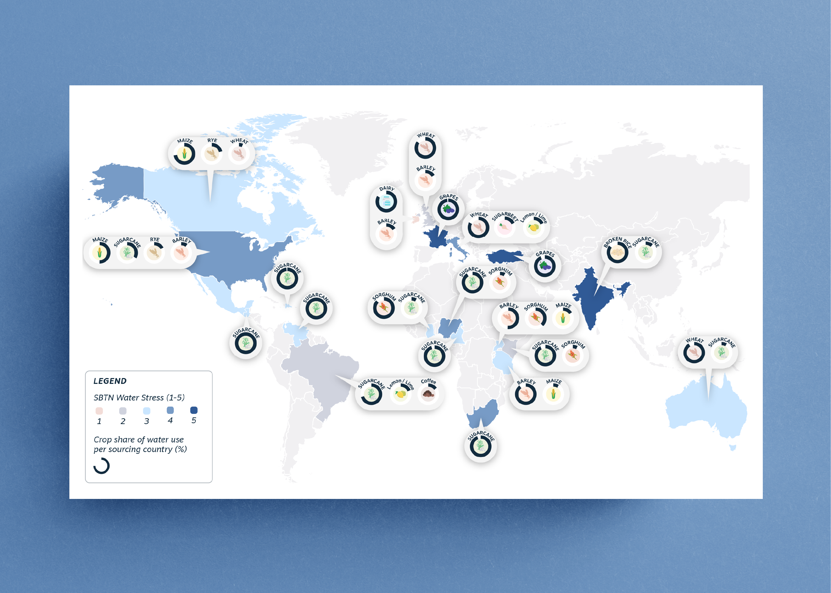
When working on making the impact of an industry tangible, a hierarchy of information becomes essential. The aim of my visualisation has always been to help clients clearly:
- Identify which step of their industry is having a greater impact.
- Distinguish categories of sectors and materials in their supply chain.
- Identify opportunities and points where they can intervene to shift to a more circular system.
Each project followed a collaborative and iterative workflow, where design decisions were shaped through continuous feedback from the team of researchers and consultants and in relation to the specific goals of the project. The process often involved designing not only standardised data visualisation with basic charts, but also complex representations of material flow (MFA), heatmaps, geographical maps, and visual frameworks.