.svg)
Monogramma Personale is the output of an exercise to develop a personal logo and its functions and uses in different supports.
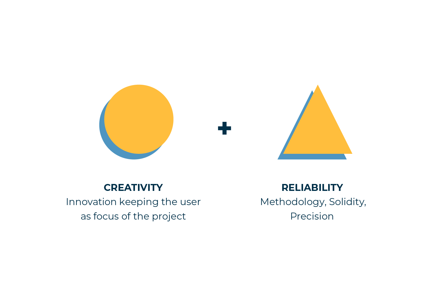
The aim of the course was to design a logo using the combination of the two initial letters of student’s Name and Surname, giving also a specific personality and identity to the logo.
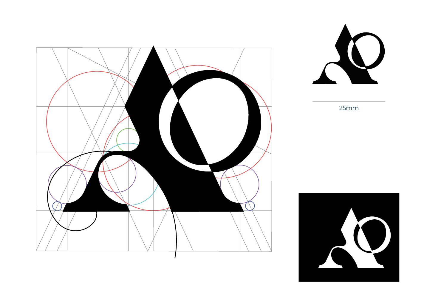
The concept behind the logo is the intersection between curved lines ( from the letter “O”) and straight lines ( from the letter “A”) to represent the dinamysm of my personality, innovative and methodic at the same time. The making of the logo included a study of proportions respecting a specific constructed grid and the Golden ratio.
After some tweaks, the logo made thanks to this project became as the basis to developed my current Brand Identity.
The first step of the work consisted on a research phase, studying how I wanted to represent the concepts of Creativity and Reliability and benchmarking already existing logos and monograms using similar letters.
After this first step I went in deep with the designing phase, realising some handmade sketches trying to express, through the realisation of shapes, feelings like confidence, creativity and reliability. Once the main sketch has been made, I designed my own grid integrated with the Golden ration.
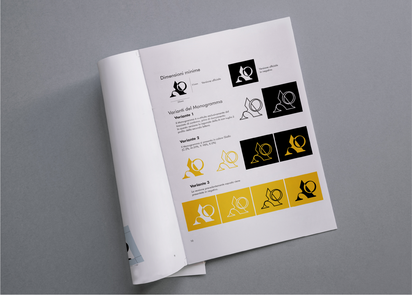
The final output of the workshop is a booklet that narrate all the process behind the designing of the logo, the guidelines of its uses, the choice of palette colours and fonts.
Also I wanted to design another support for my logo, with the realisation of my personal Business Card, printing my logo and info on a Fedrigoni paper.